
Class 11-commerce TR JAIN AND VK OHRI Solutions Statistics for Economics Chapter 7: Frequency Diagrams, Histograms, Polygon and Ogive
Frequency Diagrams, Histograms, Polygon and Ogive Exercise 128
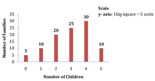
Solution SAQ 1
The given distribution can be represented with the help of a bar diagram as follows:
Bar Diagram
Solution SAQ 2
- Histogram: A histogram is two dimensional diagrams.
- Frequency Polygon: A frequency polygon is drawn by joining the mid-points of all tops of a histogram. Here, the points are joined by using a foot rule.

- Frequency Curve: Similar to frequency polygon, a frequency curve is drawn by joining the mid-points of all tops of a histogram. But, the points are joined using a free hand.
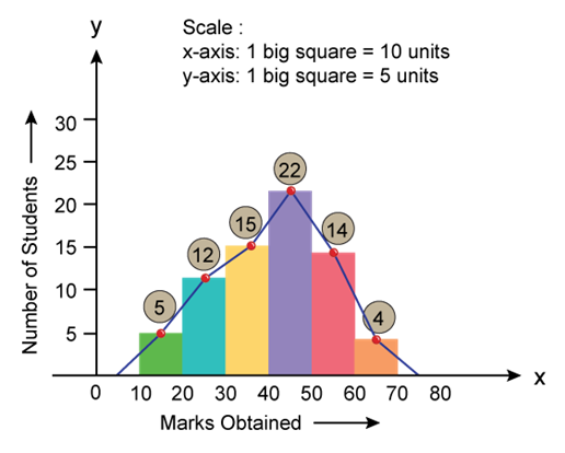
Solution SAQ 3
- Histogram:
- Frequency Polygon: A frequency polygon is drawn by joining the mid-points of all tops of a histogram. Here, the points are joined by using a foot rule.
Solution SAQ 4
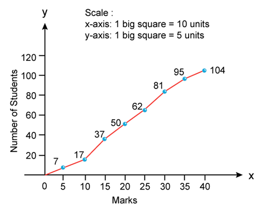
- Less than ogive curves: In this method, frequencies are cumulated and presented in a graph corresponding to upper limits of the classes in a frequency distribution. Firstly, all the data are converted into less than cumulative frequency distribution as follows-
|
Marks |
Cumulative Frequency |
|
Less than 5 |
7 |
|
Less than 10 |
7 + 10 = 17 |
|
Less than 15 |
17 + 20 = 37 |
|
Less than 20 |
37 + 13 = 50 |
|
Less than 25 |
50 + 12 = 62 |
|
Less than 30 |
62 + 19 = 81 |
|
Less than 35 |
81 + 14 = 95 |
|
Less than 40 |
95 + 9 = 104 |
This curve is drawn by plotting cumulative frequencies against the upper limit of the class intervals. And these points are joined to obtain the less than ogive curve.
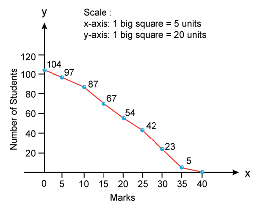
- More than ogive curves: In this method, frequencies are cumulated and presented in a graph corresponding to lower limits of the classes in a frequency distribution. Firstly, all the data are converted into more than cumulative frequency distribution as follows-
|
Marks |
Cumulative Frequency |
|
More than 0 |
104 |
|
More than 5 |
104 - 7 = 97 |
|
More than 10 |
97 - 10 = 87 |
|
More than 15 |
87 - 20 = 67 |
|
More than 20 |
67 - 13 = 54 |
|
More than 25 |
54 - 12 = 42 |
|
More than 30 |
42 - 19 = 23 |
|
More than 35 |
23 - 14 = 9 |
|
More than 40 |
9 - 9 =0 |
This curve is drawn by plotting cumulative frequencies against the lower limit of the class intervals. And these points are joined to obtain more than ogive curve.
Solution SAQ 5
Ogive curve is a smooth curve presented by plotting the frequency data on a graph. This curve represents the frequencies corresponding to lower limits or upper limits in the distribution of data.
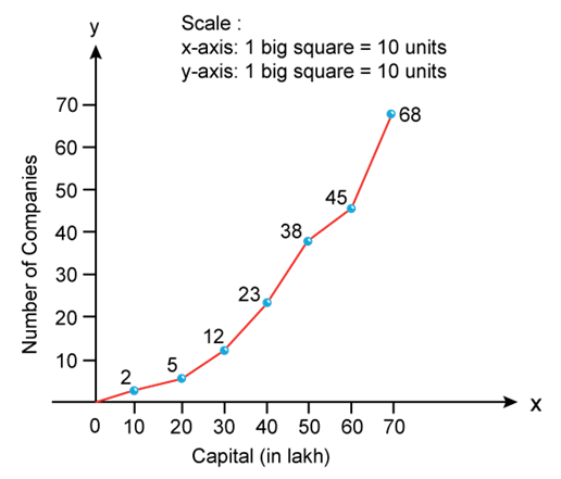
Less than ogive curves: In this method, frequencies are cumulated and presented in a graph corresponding to upper limits of the classes in a frequency distribution. Firstly, all the data are converted into less than cumulative frequency distribution as follows-
|
Capital (in lakh) |
Cumulative Frequency |
|
Less than 10 |
2 |
|
Less than20 |
2 + 3 = 5 |
|
Less than 30 |
5 + 7 = 12 |
|
Less than 40 |
12 + 11 = 23 |
|
Less than 50 |
23 + 15 = 38 |
|
Less than 60 |
38 + 7 = 45 |
|
Less than 70 |
45 + 23 = 68 |
This curve is drawn by plotting cumulative frequencies against the upper limit of the class intervals. And these points are joined to obtain the less than ogive curve.
Solution SAQ 6
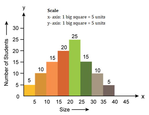
Histogram
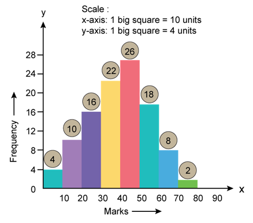
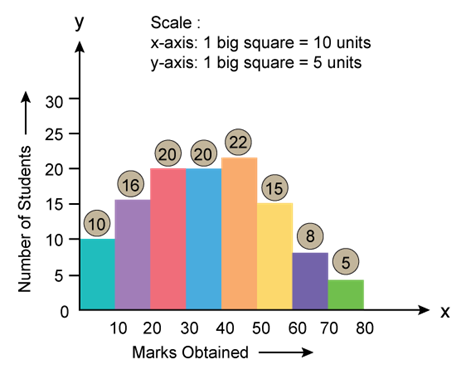
Solution SAQ 7
Histogram
Frequency Diagrams, Histograms, Polygon and Ogive Exercise 129
Solution SAQ 8
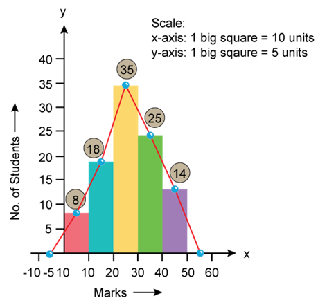
i. The frequency distribution of the given data is as follows:
|
Class Interval (Marks) |
Frequency (No. of Student) |
|
20 - 29 |
2 |
|
30 - 39 |
5 |
|
40 - 49 |
8 |
|
50 - 59 |
6 |
|
60 - 69 |
4 |
|
|
∑f = 25 |
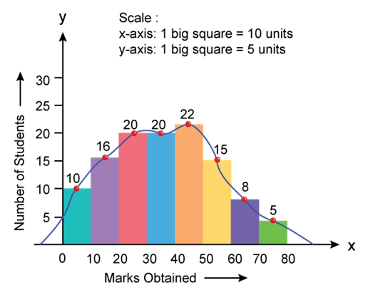
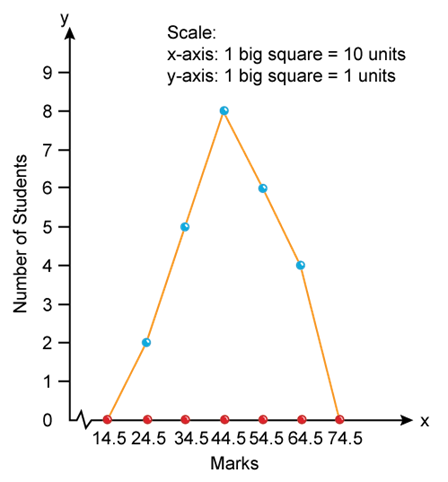
- Frequency polygon: Presenting the frequencies in the form of rectangle and joining the mid-points of the tops of the consecutive rectangles is known as frequency polygon. It is an alternative to histogram which is derived from histogram itself. However, frequency polygon can be drawn even without presenting the histogram.
Firstly, the mid points of the respective class intervals are calculated and presented graphically against their respective frequencies. Here, the points are joined by using a foot rule to obtain the frequency polygon curve.

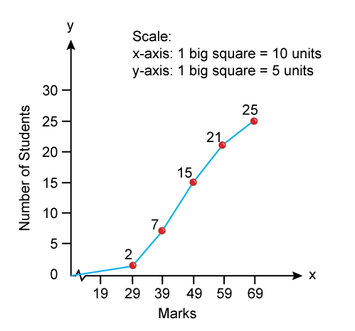
- Less than ogive curves: In this method, frequencies are cumulated and presented in a graph corresponding to upper limits of the classes in a frequency distribution. Firstly, all the data are converted into less than cumulative frequency distribution as follows-
|
Less than Ogive |
Cumulative Frequency |
|
Less than 29 |
2 |
|
Less than 39 |
2 + 5 = 7 |
|
Less than 49 |
7 + 8 = 15 |
|
Less than 59 |
15+6=21 |
|
Less than 69 |
21+4=25 |
This curve is drawn by plotting cumulative frequencies against the upper limit of the class intervals. And these points are joined to obtain the less than ogive curve.
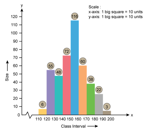
Solution SAQ 9
Only mid-points are given to draw a histogram. So these mid-points are converted into class intervals.
Procedure
Step 1: Formula to derive the class intervals corresponding to each mid-point is
![]()
![]()
Step 2: Add and subtract 5 to each mid-point to get the following class intervals.
|
Mid point |
Class Interval |
Size |
|
115 |
110 - 120 |
6 |
|
125 |
120 - 130 |
55 |
|
135 |
130 - 140 |
48 |
|
145 |
140 - 150 |
72 |
|
155 |
150 - 160 |
116 |
|
165 |
160 - 170 |
60 |
|
175 |
170 - 180 |
38 |
|
185 |
180 - 190 |
22 |
|
195 |
190 - 200 |
3 |
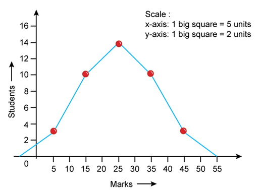
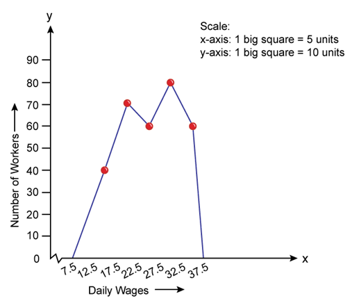
Solution SAQ 10
i. Frequency polygon: Frequency polygon can be drawn even without presenting the histogram. Firstly, the mid points of the respective class intervals are calculated and presented graphically against their respective frequencies. Here, the points are joined by using a foot rule to obtain the frequency polygon curve.

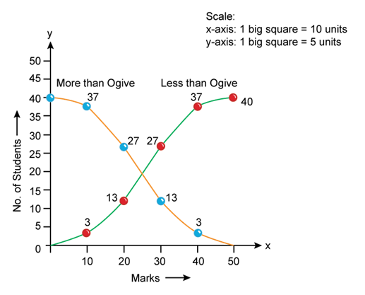
ii. Ogive curve: It is a smooth curve presented by plotting cumulative frequency data on a graph. This can be drawn by understanding the frequencies corresponding to lower limits and upper limits in the distribution of data.
Firstly, all the data are converted into more than and less than cumulative frequency distribution as follows-
|
Marks |
Cumulative Frequency |
|
Less than 10 |
3 |
|
Less than 20 |
3 + 10 = 13 |
|
Less than 30 |
13 + 14 = 27 |
|
Less than 40 |
27 + 10 = 37 |
|
Less than 50 |
37 + 3 =40 |
|
Marks |
Cumulative Frequency |
|
More than 0 |
40 |
|
More than 10 |
40 - 3 = 37 |
|
More than 20 |
37 + 10 = 27 |
|
More than 30 |
27 + 14 = 13 |
|
More than 40 |
13 + 10 = 3 |
This less than curve is drawn by plotting cumulative frequencies against the upper limit of the class intervals. And these points are joined to obtain the less than ogive curve. And more than curve is drawn by plotting cumulative frequencies against the lower limit of the class intervals. And these points are joined to obtain more than ogive curve.
Solution SAQ 12
- Frequency polygon using histogram
By plotting the mid-points of the class intervals with their respective frequencies, the mid points are joined to draw a frequency polygon.

- Frequency polygon without using histogram
Solution SAQ 13
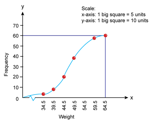
If the class intervals are equal but the series are inclusive, then inclusive series are converted into an exclusive series.
Step1: Apply the formula to convert into exclusive series

Step 2: Add and subtract 0.5 to each class intervals.
|
Weight |
Frequency |
|
29.5 - 34.5 |
3 |
|
34.5 - 39.5 |
5 |
|
39.5 - 44.5 |
12 |
|
44.5 - 49.5 |
18 |
|
49.5 - 54.5 |
14 |
|
54.5 - 59.5 |
6 |
|
59.5 - 64.5 |
2 |
i. Less than ogive curves: In this method, frequencies are cumulated and presented in a graph corresponding to upper limits of the classes in a frequency distribution. Firstly, all the data are converted into less than cumulative frequency distribution as follows-
|
Weight |
Cumulative Frequency |
|
Less than 34.5 |
3 |
|
Less than 39.5 |
3 + 5 = 8 |
|
Less than 44.5 |
8 + 12 = 20 |
|
Less than 49.5 |
20 + 18 = 38 |
|
Less than 54.5 |
38 + 14 = 52 |
|
Less than 59.5 |
52 + 6 = 58 |
|
Less than 64.5 |
58 + 2 = 60 |
This curve is drawn by plotting cumulative frequencies against the upper limit of the class intervals. And these points are joined to obtain the less than ogive curve.
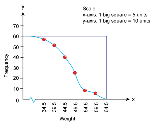
ii. More than ogive curves: In this method, frequencies are cumulated and presented in a graph corresponding to lower limits of the classes in a frequency distribution. Firstly, all the data are converted into more than cumulative frequency distribution as follows-
|
Weight |
Cumulative Frequency |
|
More than 0 |
60 |
|
More than 34.5 |
60 - 3 = 57 |
|
More than 39.5 |
57 - 5 = 52 |
|
More than 44.5 |
52 - 12 = 40 |
|
More than 49.5 |
40 - 18 = 22 |
|
More than 54.5 |
22 - 14 = 8 |
|
More than 59.5 |
8 - 6 =2 |
|
More than 64.5 |
2 - 2 = 0 |
This curve is drawn by plotting cumulative frequencies against the lower limit of the class intervals. And these points are joined to obtain more than ogive curve.
Frequency Diagrams, Histograms, Polygon and Ogive Exercise 155
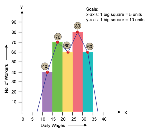
Solution SAQ 11
- Histogram and Frequency Polygon
- The first class interval is extended to the left side by half the size of class interval which denotes the initial point of the frequency polygon. And the last class interval is extended to the right side by half the size of the class interval which denotes the final point of the frequency polygon. This implies that the area not included at the time of joining the mid-points is now included in the frequency polygon. Thus, the area under frequency polygon is equal to the area under histogram.