Class 9 RD SHARMA Solutions Maths Chapter 23 - Graphical Representation of Statistical Data
Graphical Representation of Statistical Data Exercise Ex. 23.1
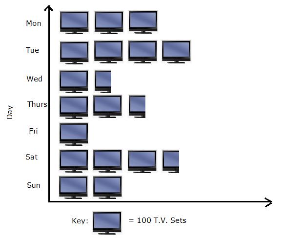
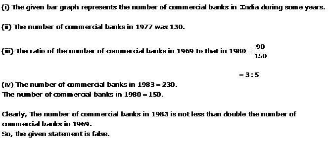
Solution 1
Solution 2
Solution 3
Solution 4
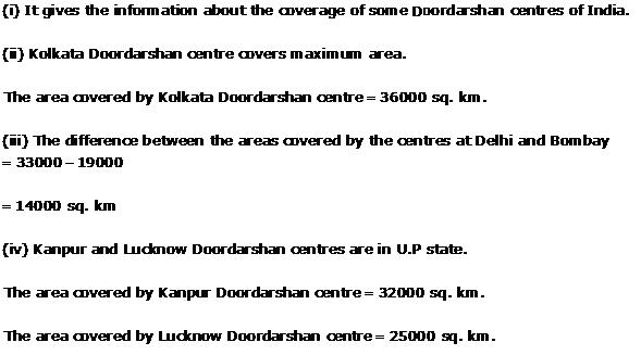
(ii) The number of tickets of Assam state lottery sold by the agent is 40.
(iii) Haryana
(iv) The minimum number of tickets sold = 20
The maximum number of tickets sold = 100
So, the given statement is false.
(v) Rajasthan
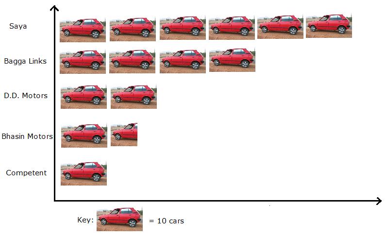
Solution 5
Solution 6
Solution 7
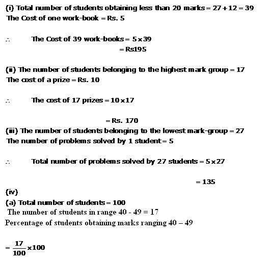
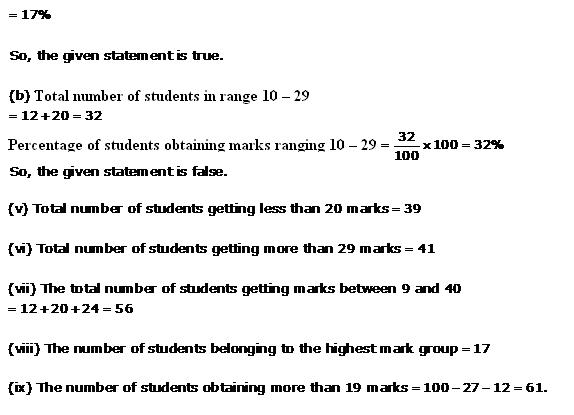
Solution 8
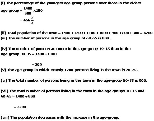
Solution 9
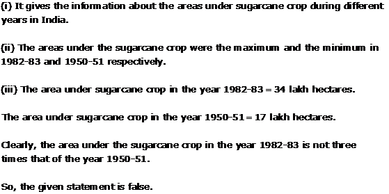
(i) It gives information regarding rice and wheat production in various states of India.
(ii) W.B is the largest produer of rice.
(iii) U.P is the largest producer of wheat.
(iv) The total production of rice and wheat is maximum in U.P.
(v) The total production of rice and wheat is minimum in Maharashtra.
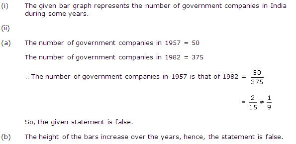
Solution 10

Solution 11
Solution 12
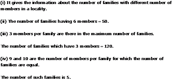
(i) Total number of newspapers published in Hindi, English, Urdu, Punjabi and Bengali = 3700 + 3400 + 700 + 200 + 1100 = 9100.
(ii) The number of newspapers published in Hindi = 3700.
Total numbers of newspapers are published = 700 + 400 + 1000 + 200 + 1400 + 1400 + 3700 + 1100 + 3400 + 1100 = 14400
The percentage of Hindi newspapers = ![]()
![]()
= 25.69
= 25.7% (approx)
(iii) The excess of the number of newspapers published in English over those published in Urdu = 3400
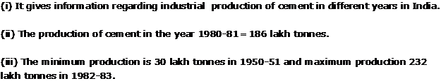
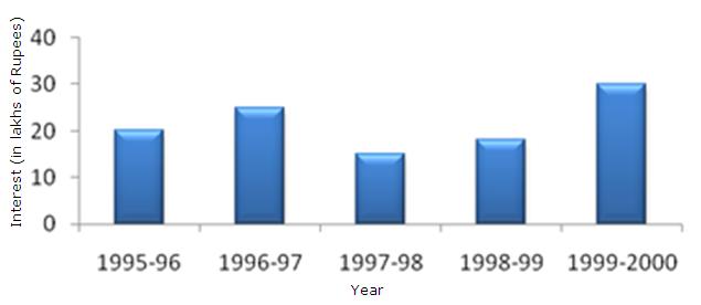
Solution 13
(ii) The crop-production of rice in 1970-71 = 42.5 lakh tonnes.
(iii) The difference between the maximum and minimum production of rice = 55 - 22 = 33 lakh tonnes.
Solution 14
(ii) In Africa the expenditure on edcation is maximum in 1980.
(iii) In East Africa the expenditure has gone by from 1980 to 1990.
(iv) In Africa the gap between 1980 and 1990 is maximum.
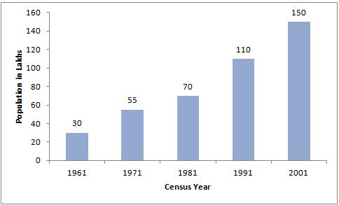
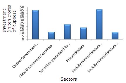
Solution 15
Solution 16

Solution 17
Solution 18
Graphical Representation of Statistical Data Exercise Ex. 23.2
Solution 1
After reading a bar graph one must be able to draw certain condusions from it. Drawing some condusions from a given bar graph means interpretation of the bar graph.
Solution 2
Solution 3
(ii) (a) VII
(iii) (b) VII
Solution 4
Solution 5
Solution 6
Solution 7
(i) Bar graph for the given data is as follows:

(ii) In 1995, the amount of loan is not increased over that of the preceeding year.
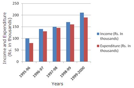
Solution 8
Solution 9
Solution 10
Solution 11
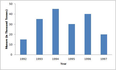
(ii) It is seen that the height of bar corresponding to year 1994 is the highest. Hence, the amount of manure manufactured by the company was maximum in 1994.
(iii) It is seen that the manure production decreased in the year 1995 and 1997.
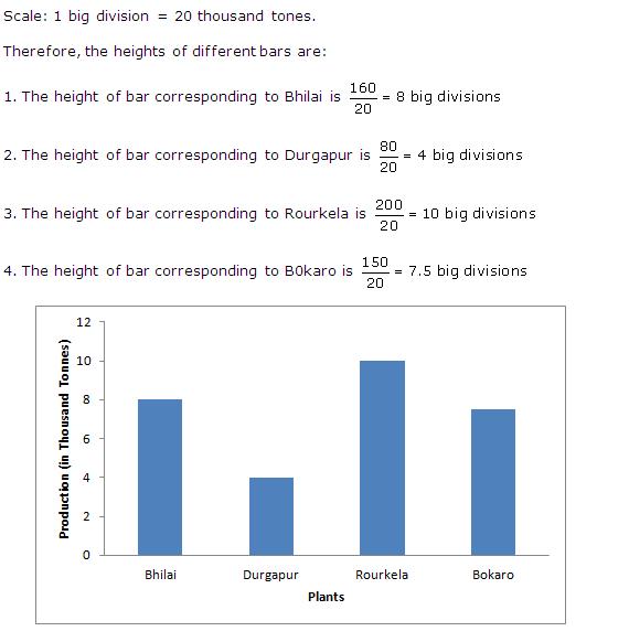
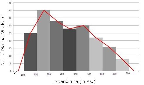
Solution 12
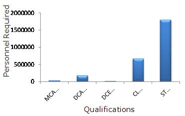
The course where estimated requirement is least is DCE
Solution 13
Solution 14
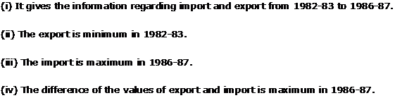
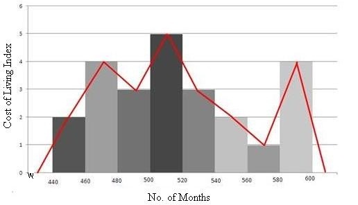
Solution 15
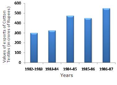
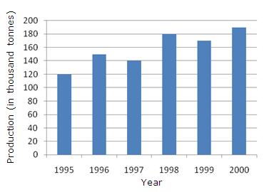
In 1986-87 the rate of increases in exports is maximum over the precending year.
Solution 16
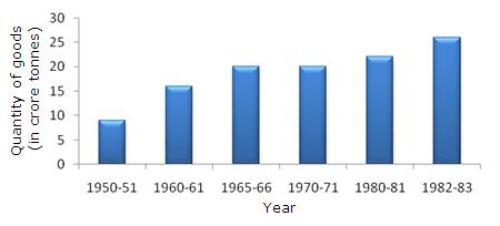
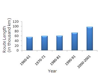
It is seen from the graph that the quantity of goods carried in the years 1950-51 and 1965-66 are 20 crores tones and 9 crores tones. Clearly 20 is more than twice of 9. Hence, the statement is true.
Solution 17
Solution 18
Graphical Representation of Statistical Data Exercise Ex. 23.3
Solution 1
Solution 2
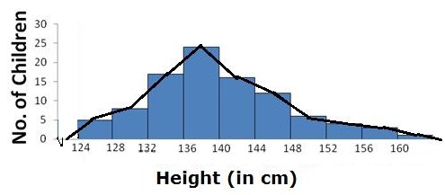
Solution 3
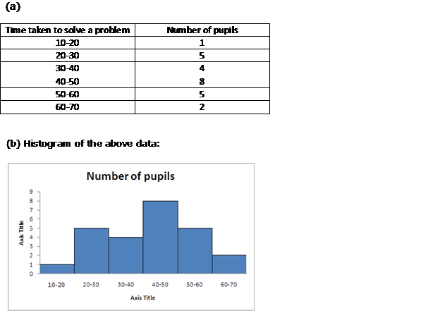
Solution 4
Solution 5
Solution 6
| Class Intervals | Class Limits | Frequency |
55.5
Solution 7 Solution 8 Graphical Representation of Statistical Data Exercise 23.42Solution 1Bar graphs, Histogram, Frequency polygon are methods of graphical representation of statistical data. A Bar graph is a pictorial representation of the numerical Data. while Histogram is a graphical representation of a Frequency distribution in the form of rectangles. A Frequency polygon of a given Frequency distribution is another method of representing frequency distribution graphically. But a cumulative frequency distribution is a table in which cumulative frequencies are distributed over various classes. Thus, Cumulative frequency distribution is not a method of graphical representation. Hence, correct option is (d). Solution 2A curve that Represents the cumulative Frequency distribution of grouped data is called an ogive or cumulative frequency curve. Hence, correct option is (c) Solution 3A Frequency Polygon is drawn by joining the mid-points of first and last class intervals to the mid-points of the imagined classes adjacent to them. Hence, correct option is (c). Graphical Representation of Statistical Data Exercise 23.43Solution 4In a Histogram, the area of each rectangle is proportional to the Frequency of the corresponding class-interval. Hence, correct option is (c). Solution 5In a less than type ogive, the cumulative frequency is plotted against the upper limit of the concerned class interval. Hence, correct option is (b). Solution 6In a Histogram, the class-intervals are represented or taken along X-axis, and frequency on Y-axis. Hence, correct option is (b). Solution 7In a Histogram, the class-intervals are represented or taken along Horizontal axis (X-axis) and frequency on Vertical axis (Y-axis). Hence, correct option is (d). Solution 8In a Histogram, each class rectangle is constructed with base as (a - b) i.e. a class intervals from a to b ..... b to c etc. Hence, correct option is (b). Get in TouchCall / Whats App |