Class 9 NCERT Solutions Maths Chapter 12 - Statistics
Statistics Exercise Ex. 12.1
Solution 1
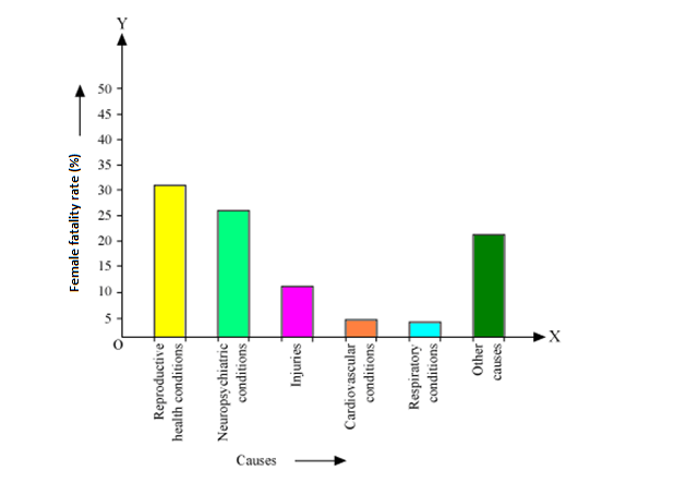
All the rectangle bars are of same width and having equal spacing between them.
(ii) Reproductive health condition is the major cause of women's ill health and death worldwide as 31.8% of women are affected by it.
Solution 2
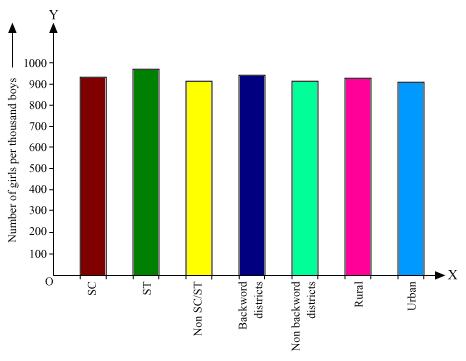
Here all the rectangle bars are of same width and have equal spacing in between them.
Solution 3
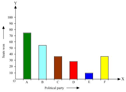
Here rectangle bars are of same width and have equal spacing in between them.
(ii). We may find that political party 'A' won maximum number of seats.
Solution 4
|
Length (in mm) |
Number of leaves |
|
117.5 - 126.5 |
3 |
|
126.5 - 135.5 |
5 |
|
135.5 - 144.5 |
9 |
|
144.5 - 153.5 |
12 |
|
153.5 - 162.5 |
5 |
|
162.5 - 171.5 |
4 |
|
171.5 - 180.5 |
2 |
Now taking length of leaves on x axis and number of leaves on y axis we can draw the histogram of this information as below -
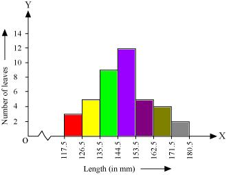
Here 1 unit on y axis represents 2 leaves.
(ii). Other suitable graphical representation of this data could be frequency polygon.
(iii). No as maximum number of leaves (i.e. 12) have their length in between of 144.5 mm and 153.5 mm. It is not necessary that all have their lengths as 153 mm.
Solution 5
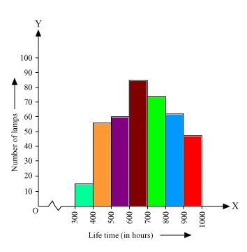
Here 1 unit on y axis represents 10 lamps.
(ii). Number of neon lamps having their lifetime more than 700 are sum of number of neon lamps having their lifetime as 700 - 800, 800 - 900, and 900 - 1000.
So number of neon lamps having their lifetime more than 700 hours is 184. (74 + 62 + 48 = 184)
Solution 6
Class mark
|
Section A |
Section B |
||||
|
Marks |
Class marks |
Frequency |
Marks |
Class marks |
Frequency |
|
0 - 10 |
5 |
3 |
0 - 10 |
5 |
5 |
|
10 - 20 |
15 |
9 |
10 - 20 |
15 |
19 |
|
20 - 30 |
25 |
17 |
20 - 30 |
25 |
15 |
|
30 - 40 |
35 |
12 |
30 - 40 |
35 |
10 |
|
40 - 50 |
45 |
9 |
40 - 50 |
45 |
1 |
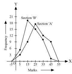
From the graph we can see performance of students of section 'A' is better than the students of section 'B' as for good marks.
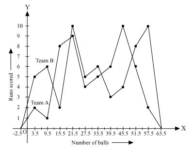
Solution 7
 = 0.5 to upper class limits and subtract 0.5 from
Also class mark of each interval can be found by using formula -
|
Number of balls |
Class mark |
Team A |
Team B |
|
0.5 - 6.5 |
3.5 |
2 |
5 |
|
6.5 - 12.5 |
9.5 |
1 |
6 |
|
12.5 - 18.5 |
15.5 |
8 |
2 |
|
18.5 - 24.5 |
21.5 |
9 |
10 |
|
24.5 - 30.5 |
27.5 |
4 |
5 |
|
30.5 - 36.5 |
33.5 |
5 |
6 |
|
36.5 - 42.5 |
39.5 |
6 |
3 |
|
42.5 - 48.5 |
45.5 |
10 |
4 |
|
48.5 - 54.5 |
51.5 |
6 |
8 |
|
54.5 - 60.5 |
57.5 |
2 |
10 |
Now by taking class marks on x axis and runs scored on y axis we can construct frequency polygon as following -
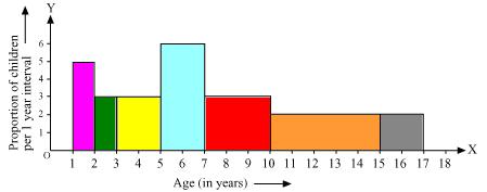
Solution 8
|
Age (in years) |
Frequency (Number of children) |
Width of class |
Length of rectangle |
|
1 - 2
|
5
|
1 |
|
|
2 - 3 |
3 |
1 |
|
|
3 - 5 |
6 |
2 |
|
|
5 - 7 |
12 |
2 |
|
|
7 - 10 |
9 |
3 |
|
|
10 - 15 |
10 |
5 |
|
|
15 - 17 |
4 |
2 |
|


Now taking age of children on x axis and proportion of children per 1 year interval on y axis we may draw histogram as below -
Solution 9
|
Number of letters |
Frequency (Number of surnames) |
Width of class |
Length of rectangle |
|
1 - 4 |
6 |
3 |
|
|
4 - 6 |
30 |
2 |
|
|
6 - 8 |
44 |
2 |
|
|
8 -12 |
16 |
4 |
|
|
12 - 20 |
4 |
8 |
|


Now by taking number of letters on x axis and proportion of number of surnames per 2 letters interval on y axis and choosing an appropriate scale (1 unit = 4 students for y axis) we will construct the histogram as below
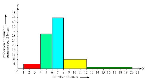
(ii). The class interval in which the maximum number of surname lie is
6 - 8 as there are 44 number of surnames in it i.e. maximum for this data.